Add Life to Your Buttons with an Animated Gradient Border in Tailwind CSS v4
We all love a good gradient. But what if you could make that gradient move — giving your buttons and links a smooth, animated vibe that catches the eye?
In this post, I’ll walk you through how to create a smooth animated gradient border around an element using Tailwind CSS v4. No plugins, no fuss — just a sprinkle of custom CSS and the power of utility-first styling.
Let’s dive in! 🚀
🏳️🌈 Gradient Generator Tool & Gradient Gallery
🧱 Step 1: Set Up the Gradient Border
Before jumping into animation, let’s get the basic gradient border working.
Here’s how it works:
- Use a wrapper with a gradient background.
- Add
paddingto create space between the outer border and the inner content. - Inside, use a solid background (like white) to contrast the border.
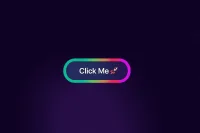
<a href="#" class="block rounded-full bg-gradient-to-r from-green-400 via-blue-500 to-purple-500 p-1">
  <span class="block rounded-full bg-white px-10 py-4 text-lg font-medium">
    Click Me 🚀
  </span>
</a>
💡 Quick Tip: The outerp-1creates a visible border thickness. Want a thinner border? Tryp-0.5orp-px.
🌈 Step 2: Make the Gradient Move
Now comes the fun part — adding motion to the gradient.
We’ll do this with a custom animation using regular CSS, while keeping Tailwind for everything else.
@keyframes moveGradient {
  0%, 100% {
    background-position: 0% 50%;
  }
  50% {
    background-position: 100% 50%;
  }
}

.animate-gradient {
  background-size: 400% 400%;
  background-position: 0% 50%;
  animation: moveGradient 6s ease infinite;
}
🎯 Now Update the HTML:
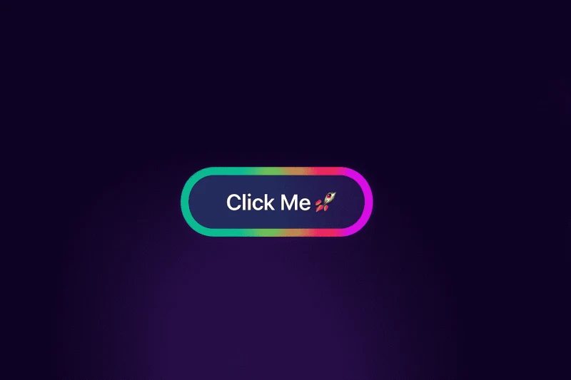
<a href="#" class="block animate-gradient rounded-full bg-gradient-to-r from-green-400 via-blue-500 to-purple-500 p-1">
  <span class="block rounded-full bg-white px-10 py-4 text-lg font-medium">
    Click Me 🚀
  </span>
</a>
🧠 What’s Happening Behind the Scenes?
.animate-gradient: Adds the custom animation using CSS.background-size: 400%: Enlarges the background, so the gradient has room to move around without repeating awkwardly.bg-gradient-to-r from-green-400 via-blue-500 to-purple-500: Defines the animated gradient colors.
🎨 Step 3: Try These Cool Variations
- Color Play: Try
from-pink-400 via-yellow-400 to-red-500 - Speed Control: Use
animation: moveGradient 3s ease-in-out infinite; - Easing Tweaks: Experiment with
ease-inorlinear - Background Size: Use
background-size: 200%for tighter movement
✍️ Author
Dilshad
Dilshad Ahmed is a Software Engineer and founder of TemplateSee and The Coding Journey. Through his YouTube tutorials and blog content, he helps thousands of learners build real-world projects and improve their web development skills.